Friday, December 2, 2005
More Animal Kingdom
Earlier I mentioned how Disney adds theming in places you would not necessarily expect it and showed some bathroom photos from pizzafari, now one of the challenges the Imagineers faced in Animal kingdom is that much of the theming in this park is more "gritty", with various aging treatments applied to various surfaces, but, the last place you want to feel "gritty" is a bathroom, but the photos below show how they rose to that challenge while still maintaining a sparkling clean facility, this bathroom is in the Tusker House Restaurant.
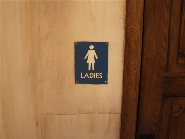
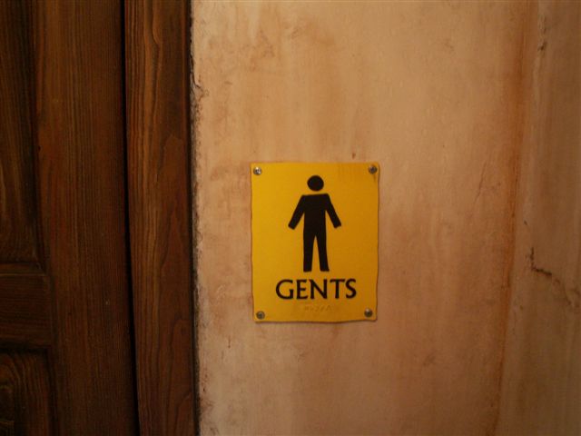
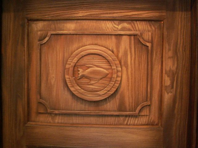
Above and Below: one way the imagineers gave this restroom are a feeling to put it in the "real" world is with the signs in this area, at the the bathroom entrance there are three doors and they used different signs on each door, the Ladies and "Gents" rooms still include the international restroom symbols for men and women, and you can even make out the fact that they seem to have it in Braille below that, but they still make them look "miss-matched" the third door which is presumably a "cast-member only" door simply has a carving of a fish (which I found quite amusing, just in a not what I expected to see sort of way).
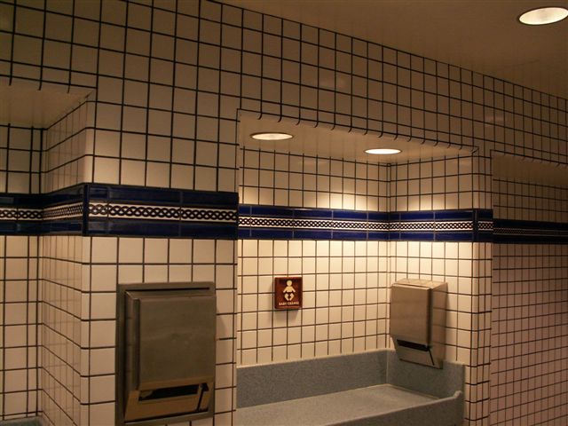
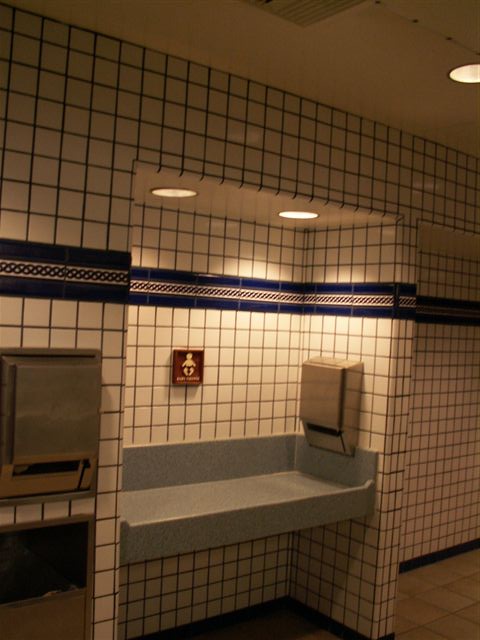
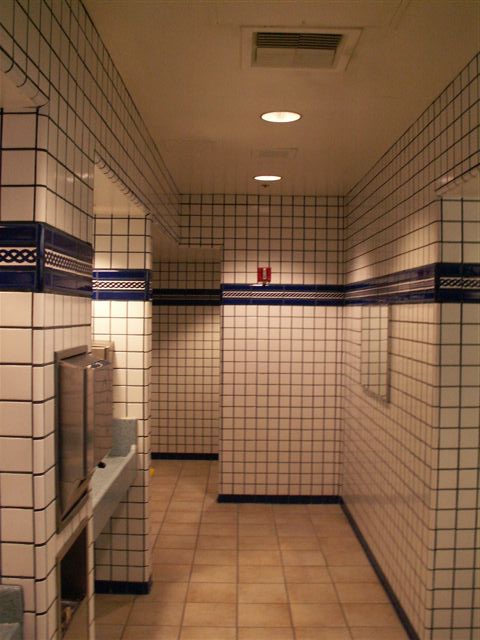
As you can see the theming in the restroom is NOT gritty, but also notice that they kept the colors much simpler than the restrooms of the Discovery Island area (like the Pizzafari restaurant) as that is a sort of fantasy setting, not tied to a real-world place, here the white tiles are some of those most commonly seen in the real world, they have been spiced up a bit with the tile "border" but still keeping the palate simple helps to not pull you out of Africa.
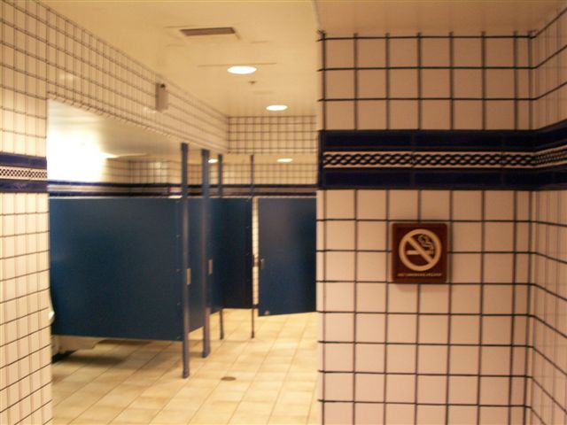
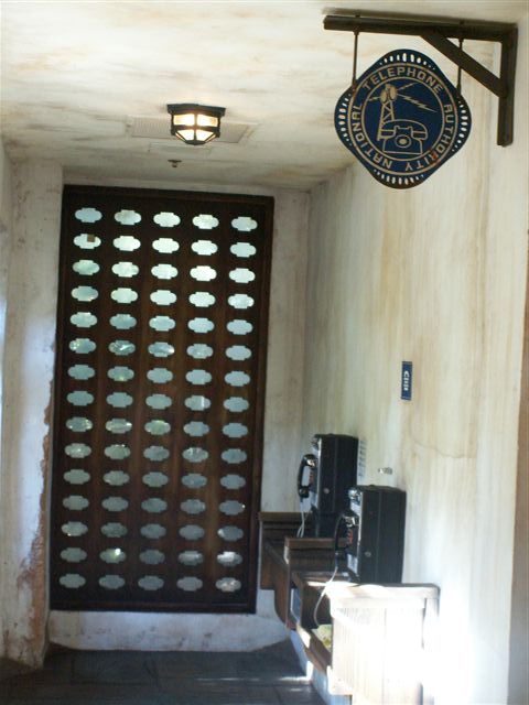
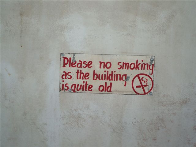
Above and Below: These signs are also in the hallway to the bathrooms once again the signs for the national telephone authority bridges the gap between being both "themed" and "functional".
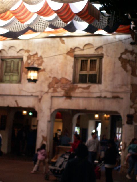
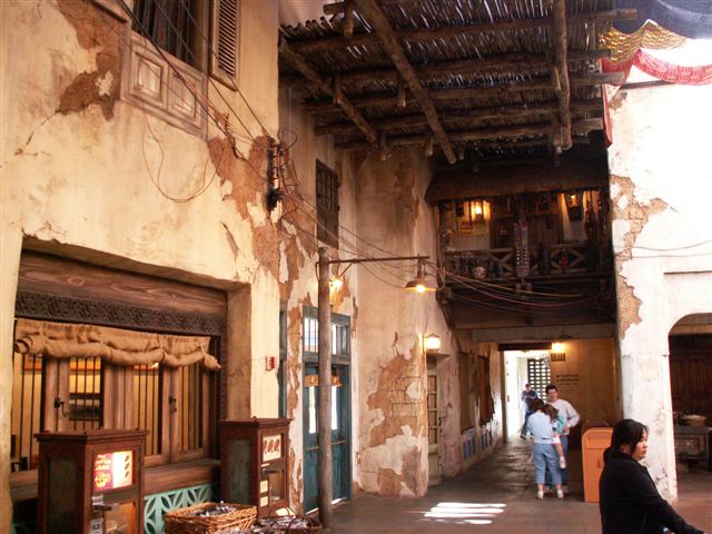
Above and Below: the central dining area at Tusker House has a "covered patio" feel, the light posts as the electrical and telephone wires attest, but I'm pretty sure is really completely "indoors".
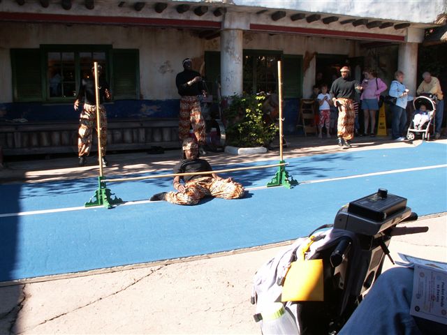
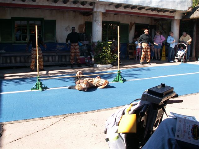
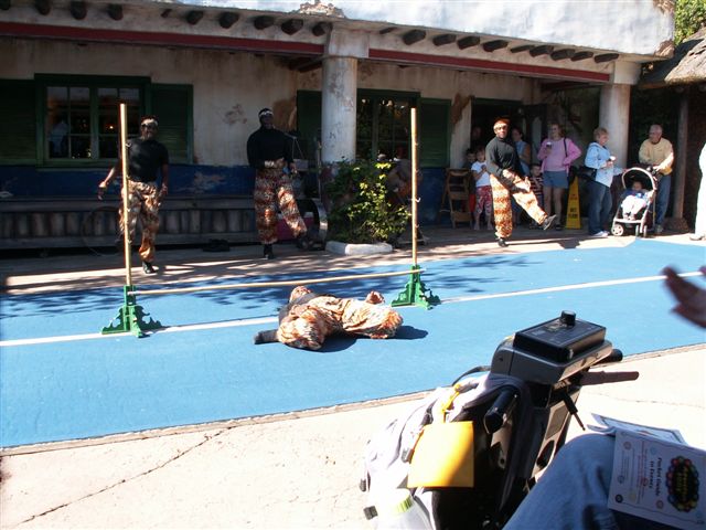
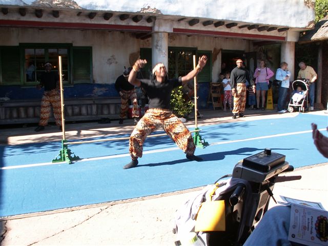
Above and Below: just outside Tusker house is a nice area where you often see live entertainment groups, obviously these guys are of the more acrobatic (or contortionist) variety this guy is amazing! I watched this show with several other Mousefesters who had the same idea of adding some entertainment to their breakfast, I don't remember who all was there but the ECV in the one photo reminds me Bonnie was there.
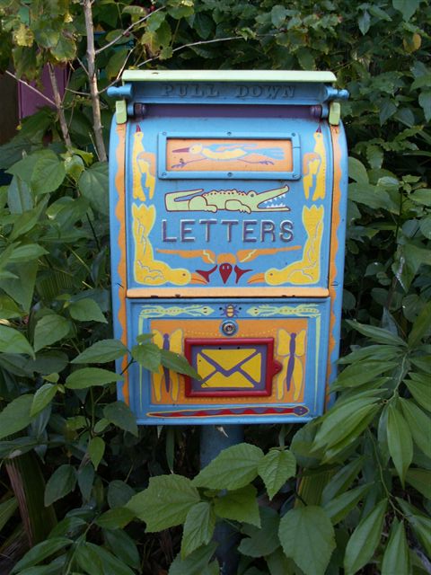
Above: being the WDW postcard guy, sometimes postal boxes in the park catch my eye, and the shot below puts this one into context.
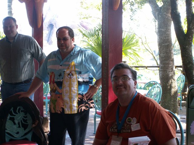
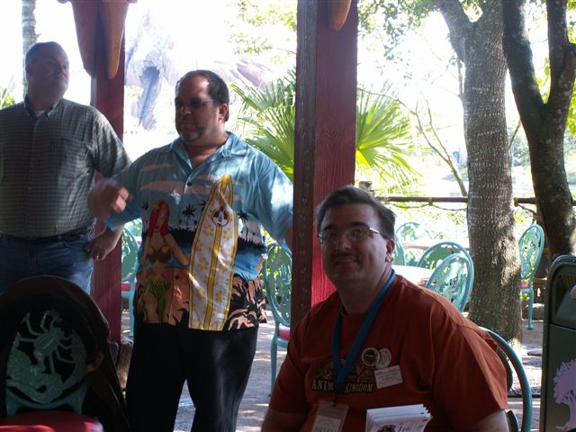
Above and below: While listening to Jim Hill at his meet, I was enjoying the view of Expedition Everest which was being built in the background, so I handed my camera to my friend to get my picture, the mountain was washed out because of the contrast difference, but it's a good picture of me and Jim.
Next Page
E-mail the webmaster Brian Martsolf martsolf@mindspring.com
Trip Reports Index Page
Big Brian's Disney Page - Main index
last updated 29-Aug-2007 10:20 AM