Walt Disney World
A History in Postcards
Chapter 3 The Vacation Kingdom of the World, Page 1: "Dash"-ing cards

"DASH"-ING CARDS


On through the 1970's the cards issued mostly followed the same pattern in numbering as the first chromes. That is they started with 01110...and ended with a three digit number. the one change to the pattern being that they all have a dash in the middle of the number. some end with 0200 series suffixes and some with 0300 series suffixes. All followed the pattern 01110-0xxx (with the three x's representing the three digit number).

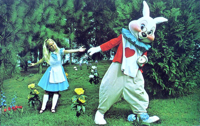
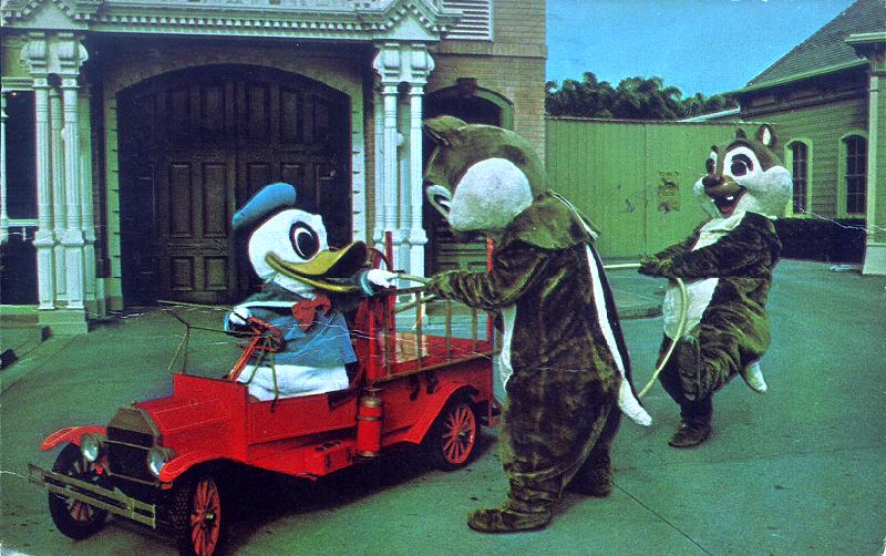
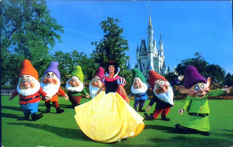
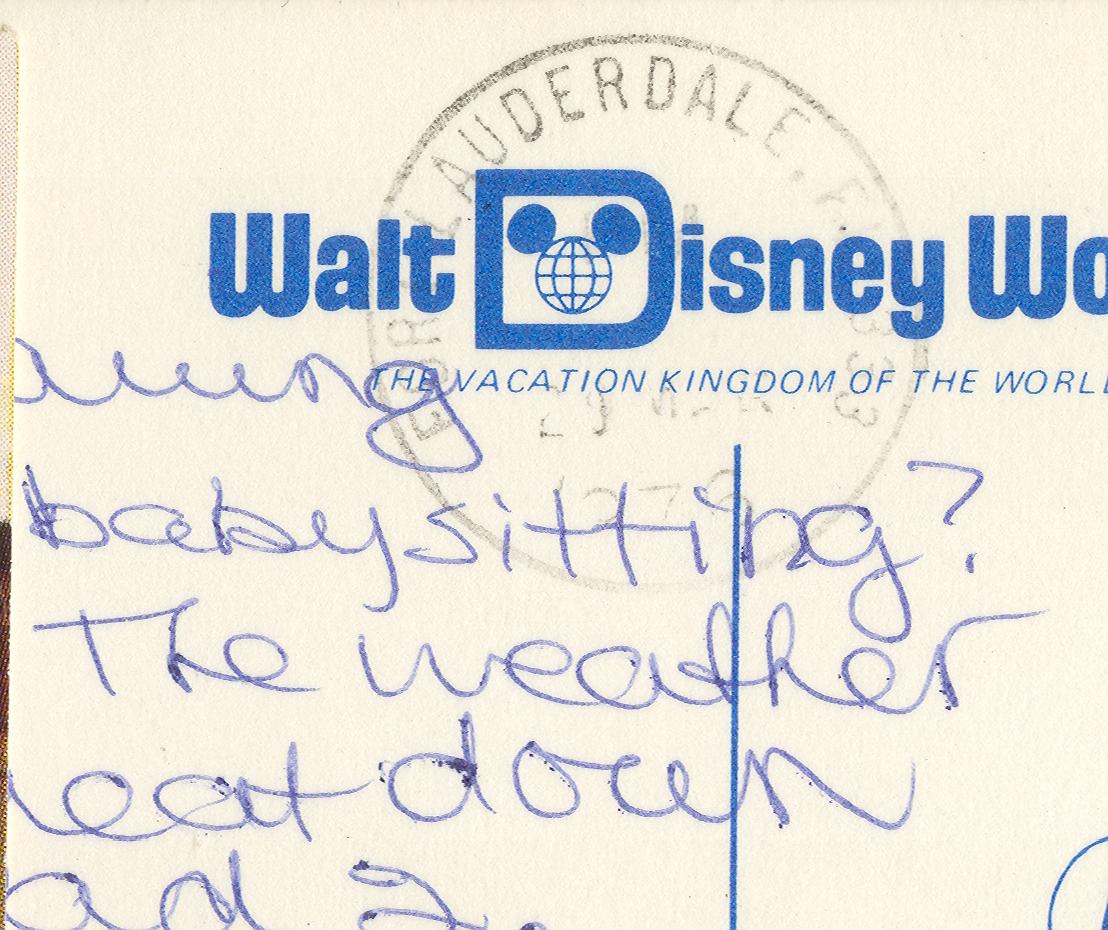
These cards were sold along side some of the images from the previous chapter that continued to be printed. Some of the "gaps" filled by the cards in this chapter were, character views, night time views, new attractions and new parades. All of the used post cards I have in this series have post marks between 1975 and 1981. Of the posted cards I have the few 0111-0200 series posted cards I have possess later postmarks (one 1978 one 1980 and one 1981) . The higher numbered 0111-1000 and higher cards are probably also later views, in fact the 0111-1600 series seem to all be replacements for earlier character views reflecting the refinements made in character costuming during the late 1970's

The two used copies of 0111-0350 WELCOME TO THE MAGIC KINGDOM that I have both have 1975 postmarks. But I suspect the one un mailed one I have of this card may even be earlier as it is the only card I have in the 0111-0300s that has a "Florida flag" on the back
0111-0350 WELCOME TO THE MAGIC KINGDOM 0111-1600 WELCOME!
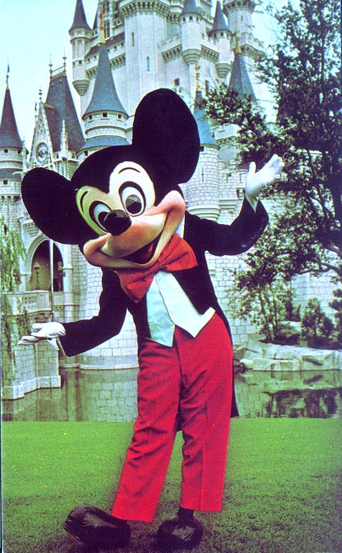
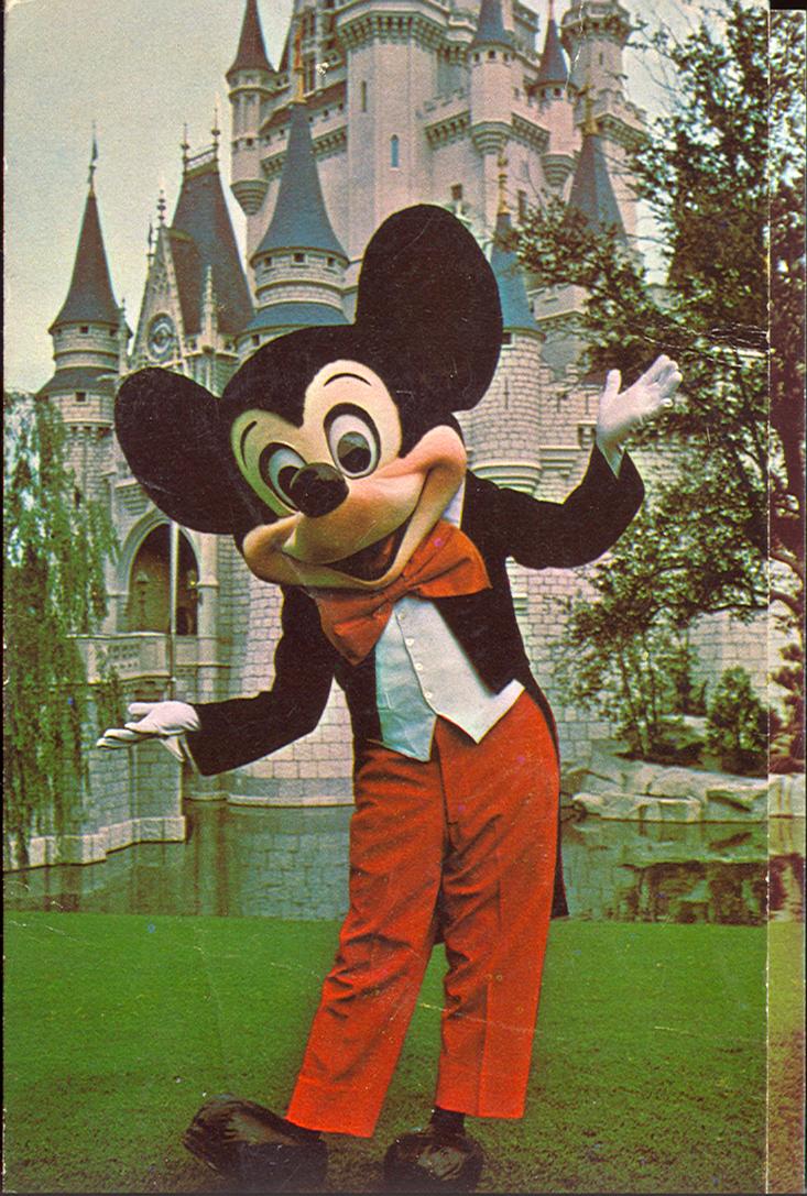
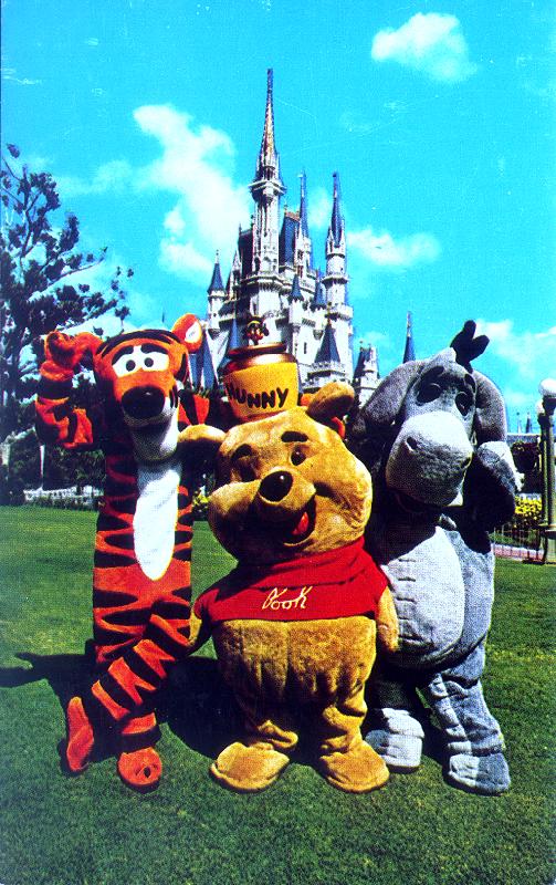
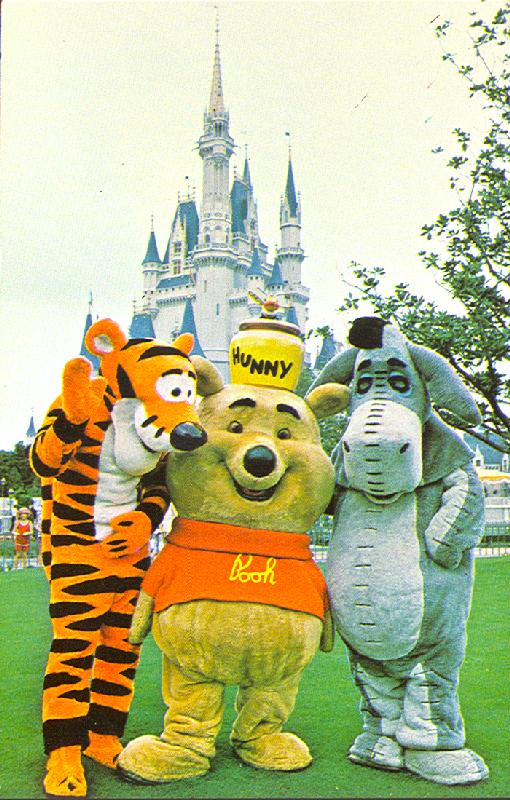
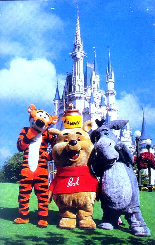
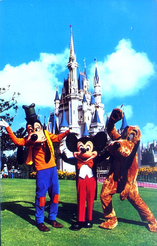
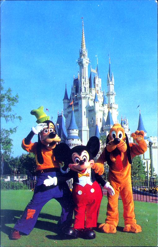
ABOVE LEFT: 0111-0350 WELCOME TO THE MAGIC KINGDOM ABOVE RIGHT: 0111-1600 WELCOME!
The two views above demonstrate how many of the later cards in this series replaced earlier views in this series, and you don't have to look to hard to see which is the earlier view, if I remember correctly the rounded hip Mickey debuted around the time of Mickey's 50th birthday in 1978, the "straight legged pants" version would have pre dated that. At least one card in this series replaced a view from the regular series the card below 0111-1601 "YOU'RE AS WELCOME AS CAN BE ..." looks like a replacement for 01110236 "WELCOME TO THE MAGIC KINGDOM". But, not only character views were replaced the vertical castle views below would seem to have been redundant had they appeared at the same time.
YOU'RE AS WELCOME AS CAN BE ...
0111-0349 CINDERELLA CASTLE 0111-1100 CINDERELLA CASTLE
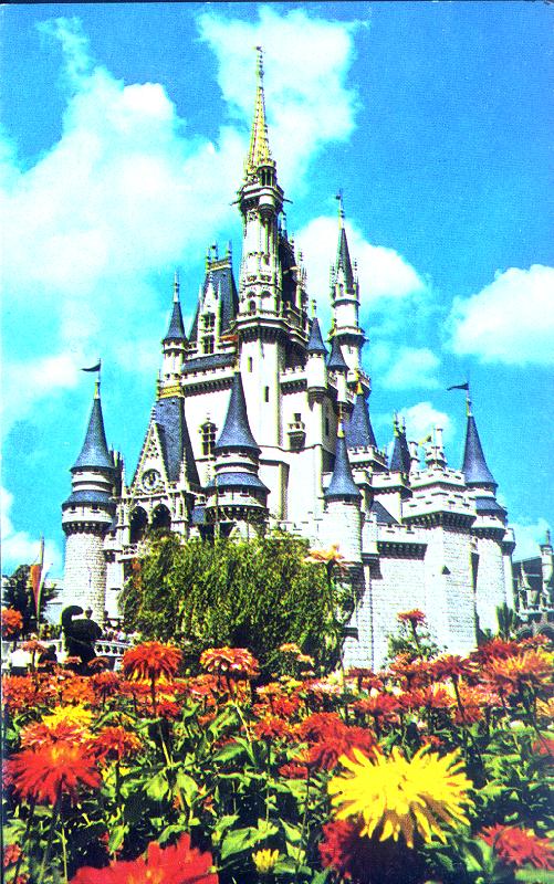
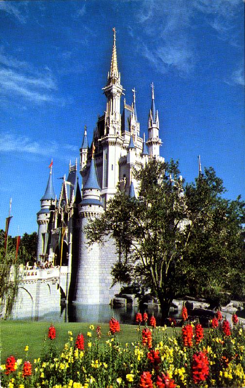
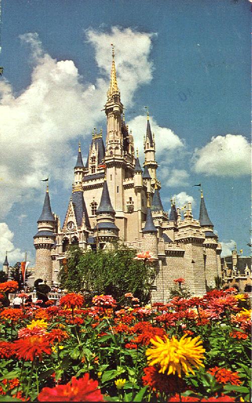
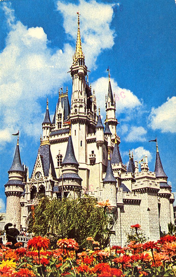
ABOVE : 0111-0349 CINDERELLA CASTLE and 0111-1100 CINDERELLA CASTLE

Let's take another look at that...

Not only does the castle card above on the right appear to have been replaced by the view on the left (again above) but that view on the right replaced an earlier view, one that had the same number and the same image...just more of it. It seems that an early version of this card was not cropped in as tightly on the castle. The one below on the left was postmarked in February of 1976, but I have other examples postmarked later in that year of the more tightly cropped version like the one on the right. 0111-0349alt-500 (48K) 0111-0349-500 (53K)

and once more again!

About a month after I discovered the more widely cropped version of card 0111-0349 (above), I was re-sorting my cards of the 0111-0000 series, I was sorting them by the color of the ink and the icons on the back of the cards. All the postcards of this series have a drawing of the castle on the back of the card, this drawing is printed along the bottom of the card back in the center. The earliest (1975) card in this series had a castle icon that I think of as the "outline castle" version, all of these cards were printed in black ink. That wide view of the castle, above, was one of those earliest printed card (with the back printed in black ink and the outline icon. The later (1976-1978) card was printed with a "solid castle" icon and it's back is printed in blue ink . The solid castle icon below is printed in black (more on that later), the blue is the same, other than the color.

dextercastle-200 (10K) solidcastle-200 (9K)

I knew that still later there was a card printed with the back in black ink, but until I was looking over the cards closely while doing this re-sorting I mentioned earlier, I had not noticed that it was cropped differently as well. Perhaps part of the reason I missed it is that the top of the card looks almost exactly the same and the difference on the sides is evenly divided, just a small bit in on each side. Still, I should have noticed the bottom, since the top changed very little, there is much more difference along the bottom. The big yellow flower on the bottom right of the first two views is cropped completely out of this version. In fact the flowers are much less prominent overall on this card than in either of the first two versions, but enough of me writing about it, take a look for yourself...

0111-0349-3rd-500 (55K)

All these different variants of this card made me start to wonder if any of the other cards in this series were cropped differently from one printing to another. Searching through them I found that the card of Mickey seemed to be cropped differently from the earlier printings to the later not cropped in tighter though with a bit more foliage on the left in earlier printings and on the right in later printings, the top and bottom borders seem to be exactly the same. You can even stack the one card on top of the other and see how they line up, the first image below is the earlier printing (black inked back with outline icon)stacked on top, the second image is stacked later (blue inked back, with solid castle icon) printing on top.


0111-0350black-500 (44K) 0111-0350blue-500 (45K)

Still, I don't know if I would call a pair of card like these variants from each other if the backs are the same, there is always going to be at least some degree of difference in the way one card is cropped (or cut in the printing process) from another, in that sense no postcards can be said to be like snow flakes no two cards are exactly alike. Still when the amount of difference is greater, and especially if there is evidence that the differences occurred during separate print runs, (for instance when the backs are different), then you might as well note the difference in the way the front is cropped as well. I also found that a couple of the Pirates of The Caribbean cards have minor differences from one print run to another. In the first case below, both the cards have blue back but are still from different print runs , one says "PLACE STAMP HERE" in the stamp block while the other has the more usual wording "STAMP", as you can see in the scan the crop difference is top to bottom, and is as big or bigger than the difference in the Mickey card above. The second image, the one of the "Auction" scene,is a minor right to left, but it really stands out when you look at the two cards side by side, probably because two more letters of the word "MERCADO" are seen in the later blue-backed card "MER" as opposed to just the "M" showing in the earlier black with outline icon printing.


0111-0355crop-500 (52K) 0111-0356crop-500 (39K)

Still, not all images in this series repeated themselves later in this same series, the following two images were all new to this series.
0111-0351 HURRY ALICE . . . WE'RE LATE! 0111-0352 A " QUACK " TEAM OF FIREMEN
0111-0351 HURRY ALICE . . . WE'RE LATE! and 0111-0352 A "QUACK" TEAM OF FIREMEN"
0111-1603 YOU'RE POOH-FECTLY WELCOME !
0111-0353 FANTASYLAND . . . A HUNNY OF A PLACE 0111-0353 FANTASYLAND . . . A HUNNY OF A PLACE
0111-0353 FANTASYLAND . . . A HUNNY OF A PLACE ( Above )and 0111-1604 FANTASYLAND IS JUST POOH-FECT ! (Below) shows that one group of characters whose costumes did not seem to change much through the 1970's apparently was Pooh and his buddies Tigger and Eeyore. Still this first card, above, has two versions with the same number and , 0111-0353 FANTASYLAND . . . A HUNNY OF A PLACE . As you might imagine the version with the grey skies is the earlier version, not only does the card I first found like this bear an earlier stamp and postmark, but since then I found one of those "grey skies" version with a black inked back with the " outline icon" castle postmarked in DEC of 1975. Not only is the sky clearer in the later view, but I believe that the character poses on that card show off the characters personalities better. Why would they replace that view with this overcast one with a less energetic Tigger pose, and an Eeyore who looks really ticked off.
By the end of the decade, even though the costumes still had not changed, a new card featuring this trio was issued as a part of that larger series of replacement character views.
0111-1604 FANTASYLAND IS JUST POOH-FECT !

0111-1604 FANTASYLAND IS JUST POOH-FECT

0111-0373 MICKEY AND PALS WELCOME GUESTS TO FANTASYLAND 0111-1602 YOU'RE AS WELCOME AS CAN BE

ABOVE LEFT:0111-0373 MICKEY AND PALS WELCOME GUESTS TO FANTASYLAND and ABOVE RIGHT: 0111-1602 YOU'RE AS WELCOME AS CAN BE I'm guessing the reason they made the second card with the new number is that Mickey's costume seems to have changed a good bit by the time the second card was made. In particular look he has a more rounded body (hips) by the time of the latter card.
0111-0370 HI-HO! HI-HO!
0111-1605 SNOW WHITE AND THE SEVEN DWARFS


E-mail Me martsolf@mindspring.com


WDW in Post Cards Table of Contents


Onward to : Chapter 3 The Vacation Kingdom of the World, Page 2: On With The Show


Back to bigBrians Disney page


Last modified by Brian K Martsolf at 24-Apr-2006 12:30 PM .