This page is not meant to be an exhaustive list of all the logos ever used on the backs of Walt Disney World past cards, it is more of a general overview of the most common logos. The designations to the left of the scans of some of the logos, like 1W, 4W, 2E, 2M, Etc. is for those comparing these logos to the designations of logos in the appendices of this site, where lists of all the WDW cards printed that I am aware of are.
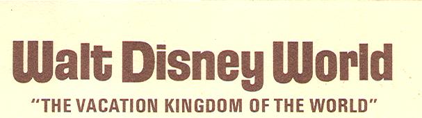
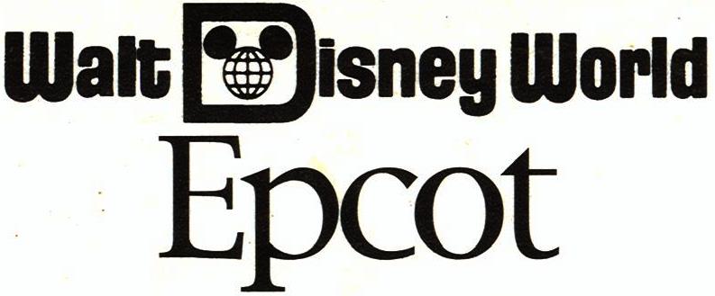
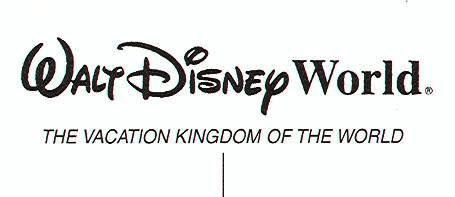
This first logo was only used for one year, and that was before WDW even opened. This logo appeared on cards sold at the Walt Disney World preview Center from January of 1970 until the first few months of 1971 when cards with the next logo were phased in. Interestingly the "Mickeyglobe D" that makes the difference between this logo and the next one did already exist but appeared at the bottom of the card back instead of as the " D" in the word "Disney". Much later a similar logo to this was used when the same aforementioned "Mickeyglobe D" was removed from the phrase Walt Disney World, presumably to make a less cumbersome logo for Epcot, only in that case it appeared without " The Vacation Kingdom of The World " phrase as part of it.
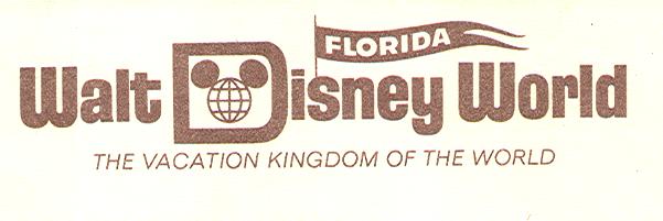
This logo was used not only at the preview center in 1971, but also for the first few years the park was open, as mentioned in the first chapter the addition of the "Florida pennant" to the logo was presumably to increase public awareness of the new resorts location.
other Magic Kingdom logos
1WĀĀĀĀ |
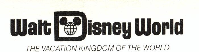 |
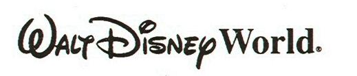
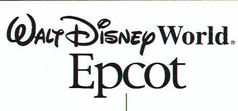
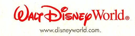
The logo above and the one below are simply different colored versions of the longest lived Walt Disney World postcard logo virtually all WDW cards issued from the mid 1970's until the opening of Epcot (with the notable exception of the Lake Buena Vista Village series) and even after Epcot opened appeared on just about all Magic Kingdom cards and cards issued for non-parks areas of the resort (Water Parks, Discovery Island, WDW shopping Village (after it's name change from Lake Buena Vista Village, and Hotels) until 1997 when the "script logo" first appeared.

A Funny Thing...
In 1979 a series of Walt Disney World cards was issued featuring art of the Disney characters on large 5 X 7 cards with rounded corners, These " cartoon cards " not only often feature something funny on the front, but there's something funny (in the other sense of the word) on the backs of the cards. Instead of featuring the standard WDW logo with the phrase "The Vacation Kingdom of the World " it featured that logo without that distinctive turn-of-phrase. These cards were popular enough that the series was extended over the years and along with it this version of the logo was repeated until it too was finally replaced by the "script logo" as well. Oddly enough other larger than 4 X 6 cards seem to have featured the regular 1W logo.
1W-VĀĀĀĀ |
 |
Some people just don't like change
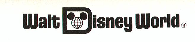
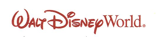
Right around the time I started to collect WDW postcards the logo on the back of the cards changed over from the old log to the new one. Some of us miss the old logo with that neat little Mickeyglobe graphic in the "D" and the phrase "The Vacation Kingdom of the World ", at first I may have been one of them, but there is something I like about the new logo, I like the way that in a sense it reconnects Walt Disney World the place that we all know and love today with Walt Disney the man who caused this place to be built, yet, unfortunately never lived to see even the first phase of this massive complex completed.
4WĀĀĀĀ |
 |
EPCOT
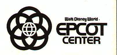
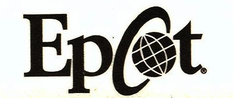
Epcot's logo has changed much more frequently over it's first quarter century than the main WDW logo, still it's first logo had about a fifteen year run. Even that logo has an element that reached back to the earliest 1970 WDW logo. The tiny print above the word Epcot reads " WALT DISNEY WORLD " without the Mickeyglobe in the " D"since the 1W logo was basically the earliest logo with just that D added this element hearkens back to that, probably though they were not thinking of that at the time it just likely did not make sense to include that intricate Mickeyglobe in such tiny print where you would not be able to make out the details.
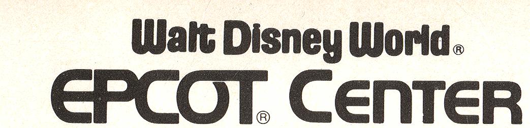
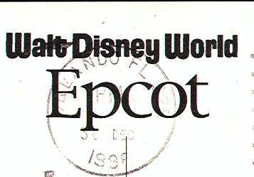
In the late 1990's the Epcot logo changed several times in just a few years. There is no guarantee that the changes occurred in any kind of logical progression but in my attempt to list them below I'm going to assume that perhaps they did, The second logo below is one that was featured on a special set of cartoon cards for Epcot featuring "Mickey around the World ", both all the countries of World showcase, and a few more not found there. It also appeared on just one Continental sized ( 4 x 6 ) postcard, one of the Wonders of Life pavilion. I think this is the next logical logo in progression both because I think those cartoon cards came out a bit earlier than some of these later logos and because that logo is made up of elements of the first logo re-assembled. The third, fourth, and fifth logo are all closely related as the "Epcot" logo had changed to a simple Times New Roman font. The third logo is an obvious progression from the second using the same WDW logo along with that new Epcot font. The fourth logo was likely used by mistake, yes it could have actually been a decision to re-include that Mickeyglobe since the WDW portion of the logo was now larger and you'd be able to see the details, but I only have it on one card so it looks to me like the printer just miss-remembered which WDW log to use with that Epcot logo. The fifth logo is of course this same logo with the "Walt Disney" portion of the logo written in the 4w or "script logo". The last logo appeared since 2001.
1E |
 |
6E |
 |
3E |
 |
4E |
 |
2E |
 |
5E |
 |
To Err is Human
I wanted to wait until after I listed the Epcot logos before I listed these last two WDW logos, and, since I believe that these logos are both sorts of errors I wanted to list them together. The reason I wanted to wait until after the Epcot logs is that I believe one of these logos evolved from a WDW logo used as part of the Epcot logos. The 2W logo looks to me as if it was used because the printer just grabbed the first WDW logo they could lay their hands on and it happened to be the one that was as the top half ot the logo on the Epcot cards at that time, it first appeared on the special postcard of WDW's castle as it appeared (dressed up like a giant pink birthday cake) during WDW's 25th anniversary celebration in 1996 and 97. Later, it also appeared on an art card promoting the new Aladdin attraction in the Magic Kingdom's Adventureland in 2001. The second error logo, 3W, only appeared on one card and is simply the mistaken inclusion of the old "The Vacation Kingdom of the World " slogan below the newer "script logo".
2W |
 |
3W |
 |
How far can we take this?Here's a variant that can be a bit hard to notice at first, the first time you notice it you almost have to take two cards and hold them side by side to be sure there really is a difference, so that's what I've provided here, a side-by-side scan of two variants of the same card one where the WDW logo of the common 4-W type is just a bit larger than the other. I refer to it in the listings as 4WLG. 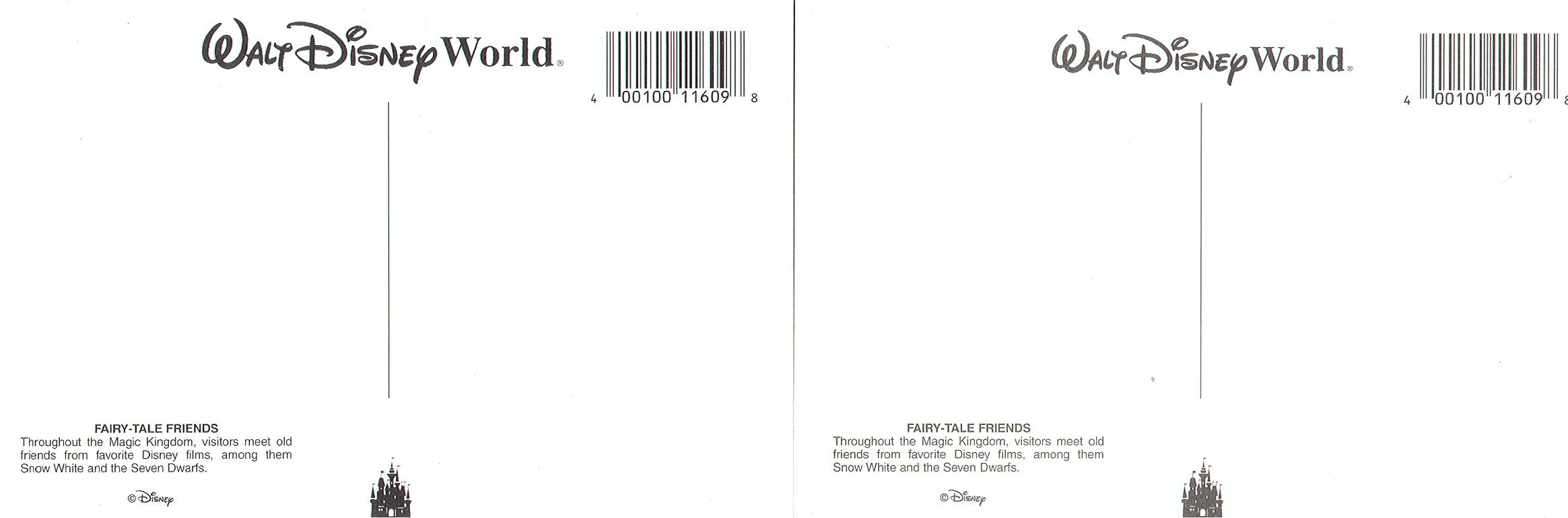 |
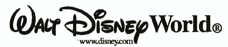
Although you can't see it in the scan the only difference in the 5W logo is its location on the card this is found on the newer cards where the logo is in the upper left hand corner. 6W and 7W are simply versions with different internet address for Disney's web site.
5W |
 |
6W |
 |
7W |
 |
Disney MGM studios has changed it's logo the least over the years, it was also the first park to use the "script logo" version of the word "Disney."
| 1M | 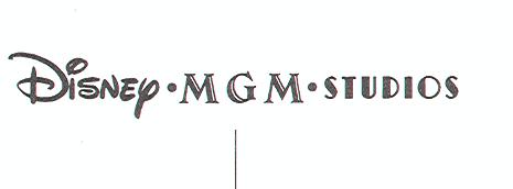 |
| 2M | 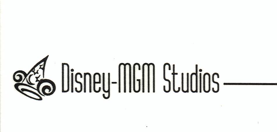 |
1A |
 |
2A |
 |
3A |
 |
4A |
 |
5A |
 |